Choice Project
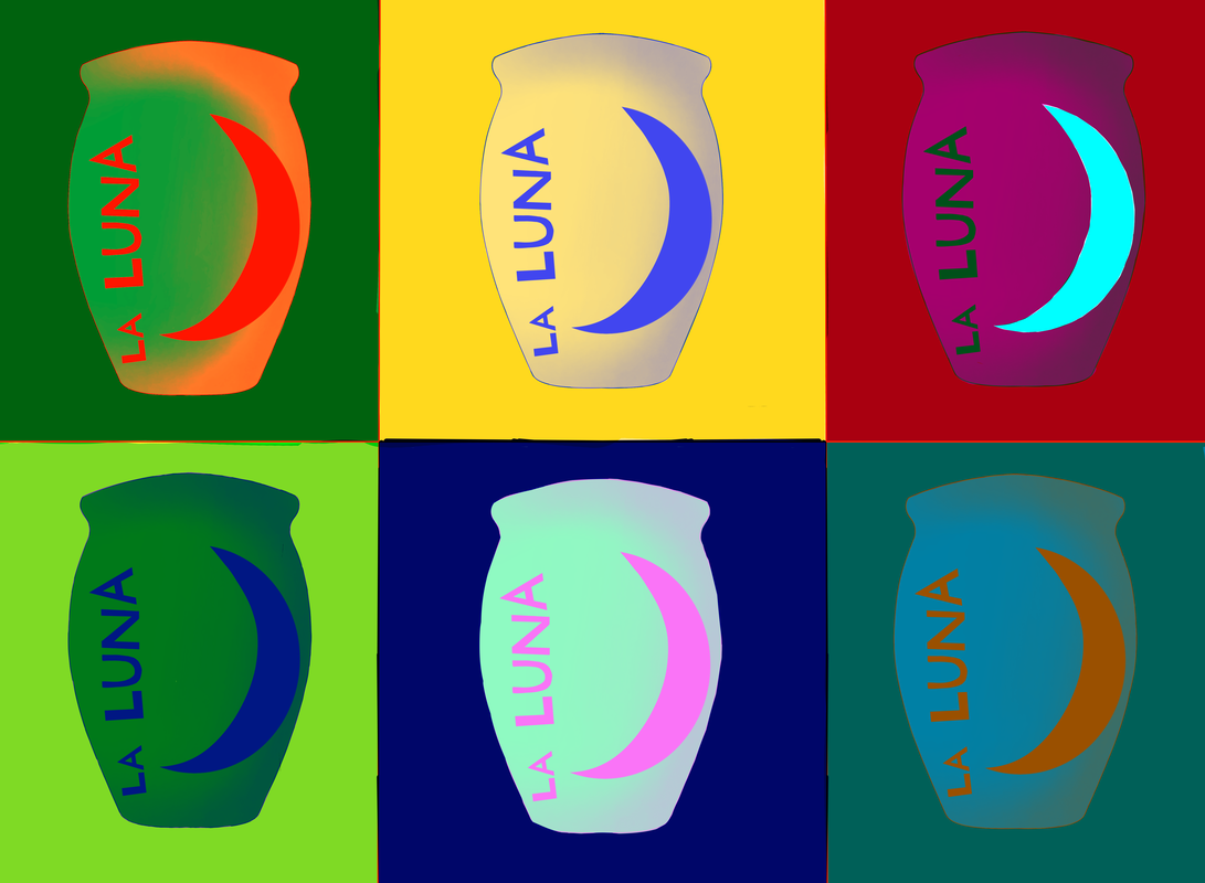
Title: Jarring Colors
Size: 22in x 30in (170 dpi) Medium: Digital Painting Completed: March 2023 |
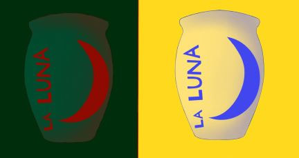
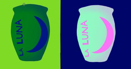
- Exhibition Text -This art piece is supposed to represent the differences in families between cultures. I took inspiration from the pop art era that made art out of everyday objects. I used this jarrito clay mug as my main focus since it's something that I use commonly, although in other cultures it might not be as common. This shows the cultural differences between families and everyday objects.
|
- Inspiration -
|
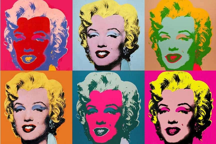
For My inspiration for my choice project I decided to choice the famous Andy Warhol. The type of work he did intrigued me, I personally love bright colors that pop. I enjoyed the contrast between colors and how they work together in order to make a type of chaos that works together neatly. I specifically liked his Marlin Monroe art, having the same picture colored and only having colored differently really changes the feel of each picture.
|
-Planning-
|
When I Thinking about all the things that I could do For my choice project it took me a while to find something that I wanted to do. I went through many ideas and concepts for art, I had thought about making a painting or maybe even a clay project. At that moment I realized that I should do something that I was comfortable with. My first idea was to do something with flowers or some sort of garden, but I realized that I couldn't connect it with any theme.
|

|

|
I thought that thinking of a theme first would be the most helpful thing to do. I experimented with the theme of freedom and with this theme I would be able to create some sort of landscape. After a while I scraped the idea entirely, the theme didn't connect to me personally and I didn't fully like the idea of painting a landscape.
|
|
That's when I finally got the idea of doing something with pop art. I had seen the Andy Warhol art with Marilyn Monroe and it really inspired me. When I looked into Pop art I found out that the movement had to do with everyday objects. For my art I wanted to use something that I use in my everyday but it isn't common within cultures. I chose to do a jarrito clay mug since Its something I use a lot and I know it's apart of a lot of other Hispanic families As well. Since there's more then one type of mug I sketched both mugs out wanting to compare them side to side. I chose the taller one without a handle since that's the one I have. These jarrito bottles can have a lot of different designs but I decided to experiment with the loteria card design. I ended up choosing the moon card since it's my favorite card within the whole game.
|

|
-Process-

|
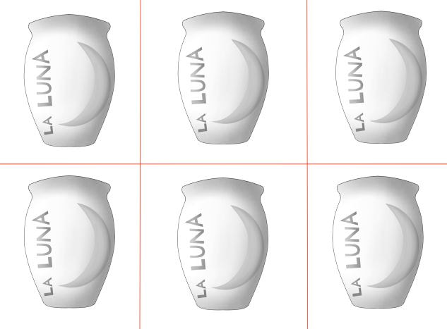
The first thing that I did was to split my canvas into 6 squares. This was something that I thought was important because when I had my drawing done I had to know where to move it. Having these squares was helpful for me to understand the placement of the drawings. It was also helpful so I could understand how big I would go and it helped me size things to the right proportions.
|

|

|

|
The next thing I did was sketch out the basic shape of the Jarrito mug, This was an important part because it helps me understand the basic placement and the size of everything. Once I have the basic shapes in place I Lower the opacity of that layer and create a new layer on top of it. For this new layer I still don't do the final line art but instead I do another sketch layer, for this sketch I'm more careful and start adding the details. Since this is the final sketch layer I make sure to keep it clean and easy to read, This sketch is basically the final product only a bit messy. Finally moving on to the line art I decided that completely coloring in the moon and letters would work in my favor.

|

|
Once finishing the line art I go into two different layers to separate the foreground and the background of the art. The background being the jar it's self while the foreground being the words and the moon, this was an important step in order to do the shading needed. I wanted to have the moon have an effect of coming off the jar since on the real jar the paint leaves a bump. I used two different layers so it would help me not mix the shades and in order to keep in a way that its easy to see the separation between the two.
|
|

|
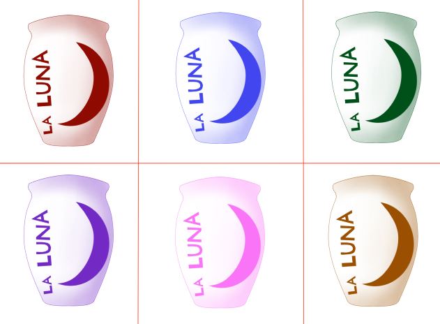
Once finishing the shading I went on to multiple the layer groups 6 times and moved them into a separate square that. I then chose 6 different colors that all pop out on there own but also help the rest of the colors pop out too. When choosing colors for the background I chose colors on the opposite side of the color wheel then the color used for the jar in that square.
|

|
|
I then went on to use an overlay layer in order to make the jars main color pop out from the background. Having the background be the same color as the jars would cause problems since it would be hard to see the outline of the jar. I used 3 different layers having each layer only color 2 squares at a time. At first I planned to only use one layer with one color but for some jars it made it impossibly to see the jar itself. I experimented with different colors for the layers and eventually found the best colors with the best squares to color.
-Critique-

|

|
|
Similarity-
As one can see the similarity between my work with Andy Warhol's work is very clear. We both used a variety of color pallets having a different one for each square. Each square has a strong background that contrasts with the imagine, this contrast makes the art pop and grabs the attention of people. |
Differences-
The Differences between my work and Andy Warhol's work can easily be seen as well. In Andy's work he has a more realistic style and has more details in his work. My Art is more simple with more flat colors. We also both used very different center pieces for the squares, Andy used Marilyn Monroe a human while I on the other had used a mug. |
-Reflection-
This project was one of my favorite projects to do, especially since I had full creative freedom to do anything I wanted to. I really enjoyed the entire process of making this art work since I was able to use a medium that I enjoy working with. The one bad thing about this was time management, since I had full creative freedom it was harder to come up with ideas. At first I thought that it would be easy to come up with ideas but it was surprisingly hard. Since I had no limitations It was harder to cut down on my ideas and with so many ideas it was overwhelming to stay on one idea.
-ACT Questions-
1. Clearly explain how you are able to identify the cause effect relationship between your inspiration and its effect on your artwork?
You can see that I used a bunch of color and you can see that like my inspiration I had multiple of one drawing.
2. What is the overall approach the author has regarding the topic of your inspiration?
I believe that he would see the clear connection between his and my art.
3. What kind of generalizations and conclusions have you discovered about people, ideas, culture, etc. while you researched your inspiration?
Since pop art is for general things used in everyday life It made me think about my life a lot more.
4. What is the central idea or theme around your inspirational research?.
Me and my time spent in the day.
5. What kind of inferences did you make while reading your research?
My inferences were that the culture your born in changes a lot of things that you do everyday
-Citations-
Andy Warhol. Marilyn Monroe. 1967: Moma. The Museum of Modern Art. (n.d.). Retrieved March 28, 2023, from https://www.moma.org/collection/works/61240
