
|
Title: Unlucky Fortune
Size: 14 x 18 inches Medium: Acrylic paint on canvass board Completed: April 2023 |
- Exhibition Text -This artwork is a reflection of how the lack of romantic attraction affects someone's self perception. The fool is meant to represent someone who isn't interested in dating and doesn't want to ever be in a relationship while the lovers represent a healthy couple. The fool feels like a fool because of the feeling of not fitting in caused by the couple since they fit in with the social norm of falling in love.
|
- Inspiration -

|
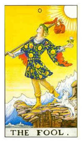
For my first inspiration I looked at tarot cards. When looking though the cards I didn't quite know what my theme would be until I found two specific cards. Both "The Fool" and "The Lovers", I really enjoy both of these cards and thought they would contract well with my own meaning.
|

|

|
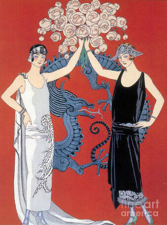
For my second inspiration I looked at George Barbier. George has a simple but elegant art style that I felt would fit With my vision. The certain art that I picked out has two lady's in it practically holding hands. I plan to use the pose for my inspiration for the lover card.
|
-Planning-

|
Knowing that I wanted to focus on the lover and fool cards I had to first come up with the poses for such cards. I wanted to first focus on the fool card since I knew I wanted to give the card a more dynamic pose to really give it that feeling of an entertainer. One aspect that I really liked and wanted to keep was the fact that the person would be balancing on a ball. I know this trick is very popular with entertaining and I really liked that it would bring in another clown aspect.
|
|
When thinking of the pose for the lovers I wanted it to be more basic and less dynamic. I also wanted to have the pose be somewhat symmetric to represent that these lovers are in sync with each other. I also knew that I wanted to include flowers in one way or another. Since flowers are often associated with romantic gestures I knew it would fit perfectly with the lover card.
|

|

|

|
Once I picked the best poses for the cards I started working on the final drafts that would I would transfer over to the canvas board. This is where I decide on the details such as the the outfits and details of where everything is placed. For the jester outfit I had a really good idea of what I was going for and didn't look at any specific types of pictures for help. For the lovers card on the other hand I did a little bit of research for the dresses but then was able to go off with the little information that I had. When starting the final draft I needed to keep in mind how I would transfer the imagine to the canvas, I used a bigger paper then normally in order to properly transfer the image.
-Process-
The first thing I did was move the final sketch to the canvas, It made a small outline so I went in and used those light line to make a line that I can better see. Once I have a solid out line of my art on the canvas I start working with color. I originally didn't have any plan with the color so I spent some time working on it. I wanted the same colors to be seen in both cards but in different ways. When looking at the colors I knew that I wanted to have the color red being an important color within both cards. The color red is associated with passion and romance so having that color present in my work would enhance the meaning behind it. I also wanted to include the color blue since it can be associated with the feeling of sadness but could also be seen as a clam color.
The first thing that I did after finding the right colors for my art work is layering down the first layer of paint on the canvas. I knew that I would need to put down more then one layer down on since the paint would be too thin if I didn't. This first layer is very important because I get to see how it would look and if I don't like the outcome I can easily find a different color that would work better. In the end For the fool card I did like the red and blue for the outfit so I kept the colors, for the lover card I also liked my direction to not have the dresses be red and blue but instead being black and sliver. Although I did plan to use red and blue in the lovers card I wanted not put it on the people and instead I wanted to use it for the flowers that would be above their heads. This would create contrast between the two works and it would work well with representing my meaning in a special way.

|

|
Once the people within both pieces are almost completely done I start my work on the actual lettering in the cards. For the letters I first thought about making them different colors in order to contrast but in the end I didn't do that. I stuck with a gold color for both cards since I thought it added a nice touch to both of them. In total I put around 4 or 5 layers on the letters in order to make sure the paint wasn't thin and that it wasn't see through. Once I finished the gold I went in again with black to outline the letters the black helped the letter to really pop out which is what I wanted.

|
Once finishing the letters I went in to work on the details within both cards. the flowers for the lover card and the ball for the fool card. for both of these I free styled it because I didn't believe that it was something to really plan on. When working on the flowers it was sort of hard because I couldn't put too much details but I needed enough to be able to separate the flowers so it wouldn't be a blob of color.
|
|
Once all the details are dried I then move on the the background. I had a clear idea of what I wanted to do for the fool card but didn't include it in the sketch thinking that I might change my idea later on. When working on the background I knew that i would have two colors and I would have them be in a checkered pattern. When Thinking of the colors I wanted them to not overtake the attention from the person in the middle. I thought at first using a green but soon realize that it would look ugly I settled on a magenta and a yellow color for the background. I felt like it would work well with the red and blue but still wouldn't make things hard to read.
|
|
-Critique-

|
|
|
|
Similarities:
When looking at my art compared to my two inspirations you can see clear connections to both of them. For the tarot cards you can see that both artworks have compositions of cards. You can also see that In one of the works the pose is directly inspired by artwork from George Barbier. |
Differences:
The differences between my art work and my inspiration is also quite obvious. For the tarot cards my art doesn't have the amount of details that the original tarot cards have. My artwork also has different aspects from artwork from George Barbier. George uses really thin lines while my lines are more on the thinker side. |
-Reflection-
When starting this project I expected it to be easy and something simple that I wouldn't need to spend too much time on. Soon enough I was proven wrong, It ended up way harder then I ever thought it would be. The hardest part of the project was doing the black outlines on everything, I needed to be really careful and needed to have complete control over my brush. I also needed to hold my hand very still, since I have shaky hands it was harder to keep control and I found myself going back a lot and redoing the lines. In the end I did enjoy this project because I was able to spend time painting and the prosses although hard was relaxing. When looking back I realize I should have gave myself more time to work since I didn't expect it to be so hard.
-ACT Questions-
1. Clearly explain how you are able to identify the cause effect relationship between your inspiration and its effect on your artwork?
You can see that I used a bunch of color and you can see that like my inspiration I had multiple of one drawing.
2. What is the overall approach the author has regarding the topic of your inspiration?
I believe that he would see the clear connection between his and my art.
3. What kind of generalizations and conclusions have you discovered about people, ideas, culture, etc. while you researched your inspiration?
Since pop art is for general things used in everyday life It made me think about my life a lot more.
4. What is the central idea or theme around your inspirational research?.
Me and my time spent in the day.
5. What kind of inferences did you make while reading your research?
My inferences were that the culture you're born in changes a lot of things that you do everyday.
-Citations-
“French Fashion, George Barbier Pochoir, 1924 Poster Print by Science Source.” Posterazzi, https://www.posterazzi.com/french-fashion-george-barbier-pochoir-1924-poster-print-by-science-source-item-varscijb9265/.
“The Fool Tarot Card.” Tarot.com, https://www.tarot.com/tarot/cards/the-fool.
“The Lovers Tarot Card.” Tarot.com, https://www.tarot.com/tarot/cards/the-lovers.
“The Fool Tarot Card.” Tarot.com, https://www.tarot.com/tarot/cards/the-fool.
“The Lovers Tarot Card.” Tarot.com, https://www.tarot.com/tarot/cards/the-lovers.
